Template talk:Featuredcharacters
What is the difference between the "others" and "misc" columns? - Starfield 12:01, 23 March 2009 (EDT)
- I think it's mostly to do with the use of alternate headers - in Armada, for instance, you have the Mini-Cons to deal with, and you rename the "Others" or "Misc" column to Mini-Cons with |h4= or |h5= accordingly. If there were only four columns, there would be no place for Mini-Cons if you had Autobots, Decepts, humans and [say] Unicron (an "Other") to deal with - SanityOrMadness 12:48, 23 March 2009 (EDT)
Is there any established criteria for what the dividing line is between "Featured Characters" and "Guests"? Is the prior classification for those with speaking parts and the latter for those who just stand in the background?Shellspark 13:29, 24 March 2009 (EDT)
- Uh... I'm pretty sure there isn't one. We don't do "Guests" anymore. Everyone gets listed, speaking part or no, in order of appearance. --M Sipher 13:33, 24 March 2009 (EDT)
- I dunno if we ever settled this. Some people still list "cameos" or whatnot when doing Featured Characters. You could argue that there's something to that, if it's a story with like a billion dudes in it, but I figure if you need to know who's really important, you can look and see who shows up in the Synopsis. -- Repowers 13:40, 24 March 2009 (EDT)
- Ok, I'll then strip the "Guests" section from these Energon episode pages and shuffle everyone into "Featured Characters". Which means I get to watch all the episodes. Again! --Shellspark 13:52, 24 March 2009 (EDT)
Makeover
[edit]The current styling on the featured characters box doesn't render the same on every browser (in IE it's got a heavy red border around it, and the cell borders vary in look as well), so I'd like to put forward a suggestion to make it look a little better. Here's my attempt:
| Autobots | Decepticons | Humans | Others | Misc |
|---|---|---|---|---|
|
|
|
|
Opinions? Complaints? Rotten fruit? :) --abates 04:46, 30 June 2009 (EDT)
- No one has an opinion? :( --abates 17:29, 22 July 2009 (EDT)
- Other than making the bottom border of the headings thicker as well, I like it. I always thought the white space borders looked silly. --Jeysie 18:24, 22 July 2009 (EDT)
- I think the black might be a bit visually heavy.
- Poke me friday if I forget to port the changes over to the temp file tomorrow. (No one ever pays attention to discussions like this until it gets rolled out.) -Derik 07:13, 13 August 2009 (EDT)
- Yeah, I think you're right on the black. More of a mid gray? --abates 16:49, 13 August 2009 (EDT)
- Looks much better, but IMO the gray should still be a little bit lighter.. -Mazenoise 16:53, 13 August 2009 (EDT)
- I've put a variety of grays on my sandbox for people to check out. --abates 17:29, 13 August 2009 (EDT)
- I like either the top one, or the middle one if the interior borders were the same grey as the outer borders. Otherwise IMHO the middle one as-is and the bottom one cause the borders to blend in too much with some of the background colors. --Jeysie 17:53, 13 August 2009 (EDT)
- All of the borders are the same gray - the vertical internal borders are thinner though. I'll adjust them so the borders are all the same width. --abates 18:16, 13 August 2009 (EDT)
- I'd go with the middle one: the bottom is too light to stand out from the "Misc" box. -Mazenoise 18:20, 13 August 2009 (EDT)
- All of the borders are the same gray - the vertical internal borders are thinner though. I'll adjust them so the borders are all the same width. --abates 18:16, 13 August 2009 (EDT)
- I like either the top one, or the middle one if the interior borders were the same grey as the outer borders. Otherwise IMHO the middle one as-is and the bottom one cause the borders to blend in too much with some of the background colors. --Jeysie 17:53, 13 August 2009 (EDT)
- I've put a variety of grays on my sandbox for people to check out. --abates 17:29, 13 August 2009 (EDT)
- Looks much better, but IMO the gray should still be a little bit lighter.. -Mazenoise 16:53, 13 August 2009 (EDT)
- Yeah, I think you're right on the black. More of a mid gray? --abates 16:49, 13 August 2009 (EDT)
- Other than making the bottom border of the headings thicker as well, I like it. I always thought the white space borders looked silly. --Jeysie 18:24, 22 July 2009 (EDT)
- Aah, I see. Yay optical illusions. :> I like the middle one best now, too. Although admittedly it's really just the purple that's any issue, as it's so much darker than the other four boxes. --Jeysie 18:36, 13 August 2009 (EDT)
- To be honest, I wanted to propose a change to the purple colouring too, but I didn't want to complicate things too much. That and I couldn't come up with a viable alternative! Please feel free to fiddle with the sandbox if you have any ideas. --abates 18:42, 13 August 2009 (EDT)
- I'm not sure either, TBH... lightening the purple would make it look too much like the Decepticons background. Pastel green I think would be a bit ugly. And a light grey would also interfere with the border colors. --Jeysie 18:52, 13 August 2009 (EDT)
- I have no colour coordination. I've lightened the purple up to match the other panels anyway. --abates 19:59, 13 August 2009 (EDT)
- I don't have any color coordination either, but I don't like that soft-salmon. It's too light.
- IIRC, when we were first choosing the box colors, we made a point to choose default web-safe colors that would display properly even on machines with a 256-color bit-depth. Try starting there.
- In fact, as long as you're mucking with the colors... I think the columns should alternate light/dark when converted to grayscale. Grayscale-readability wasn't really a concern when we first made the template (since the last laptops with grayscale-only screens were phased out in the early 2000's) but with the proliferation of web-enabled devices like the Kindle and other e-readers that posses rudimentary grayscale web-browsers, it's once again a design consideration. -20:32, 13 August 2009 (EDT)
- Ehh, I'm not entirely sold on light/dark alternating. One, the first three colors work well in terms of "branding": Red is typically an Autobot color, bluish-purple is typically a Decepticon color, and the beige works well as a fleshie color for the humans. I don't really want to change that, and I can say from experience that it can be a bit fiddly to find dark reds, purples, or browns that still register as that color and serve as a good background for readable text.
- Two, alternating between light and dark would mean having to alternate between dark and light font colors. Lightening the purple actually makes the black font on it more readable as well. --Jeysie 21:02, 13 August 2009 (EDT)
- I don't think there's any way to cater for both colour and B&W without one of them looking odd. So long as the font is clear and easily readable in B&W, I think that's good enough. --abates 21:30, 13 August 2009 (EDT)
- I have no colour coordination. I've lightened the purple up to match the other panels anyway. --abates 19:59, 13 August 2009 (EDT)
- I'm not sure either, TBH... lightening the purple would make it look too much like the Decepticons background. Pastel green I think would be a bit ugly. And a light grey would also interfere with the border colors. --Jeysie 18:52, 13 August 2009 (EDT)
- To be honest, I wanted to propose a change to the purple colouring too, but I didn't want to complicate things too much. That and I couldn't come up with a viable alternative! Please feel free to fiddle with the sandbox if you have any ideas. --abates 18:42, 13 August 2009 (EDT)
- Aah, I see. Yay optical illusions. :> I like the middle one best now, too. Although admittedly it's really just the purple that's any issue, as it's so much darker than the other four boxes. --Jeysie 18:36, 13 August 2009 (EDT)

- Slightly tweeaked colors, plus how they look in grayscale. Y/N? -Derik 21:38, 13 August 2009 (EDT)
- Why's the Unicron link yellow on the colour version? A byproduct of smoothing? It looks terribly unreadable like that. :/ --abates 22:04, 13 August 2009 (EDT)
- Because I just changed the hue in photoshop. It'll be properly blue in the final version if we like these colors. -Derik 22:50, 13 August 2009 (EDT)
- Ah! In that case, the green looks great to me. Grayscale seems readable to me, though the Kindle et al will presumably have HTML renderers optimised for grayscale anyway. --abates 23:13, 13 August 2009 (EDT)
- Throwing the template up as HTML so people can see it in action.
- Something feels off about the spacing... like maybe it needs some vertical-margins? And for some reason it feels... confined. (Which I guess, compared to the old template it is.) I feel like... I regret (?) the loss of actual wells between the columns. Their absence weighs heavy on my heart, and it's like my hands are scraping at cotton... mind-fingers thick and clumsy... now having to work noticeably harder to extract meaning from the table. /cramped and smothered/ The template is like a badly-ventilated closet; the more time I spend in it the whites of my eyes begin to bulge and the need to scream for help and escape becomes overwhelming.
- ...
- Perhaps I'm just so used to the old look that "reading" it had become a second nature. New glasses feel strange when you first put them on, as your eye re-learns its reflexes. I'll see if the feeling goes away in a few days. -Derik 02:32, 14 August 2009 (EDT)
- Ah! In that case, the green looks great to me. Grayscale seems readable to me, though the Kindle et al will presumably have HTML renderers optimised for grayscale anyway. --abates 23:13, 13 August 2009 (EDT)
- Because I just changed the hue in photoshop. It'll be properly blue in the final version if we like these colors. -Derik 22:50, 13 August 2009 (EDT)
- Why's the Unicron link yellow on the colour version? A byproduct of smoothing? It looks terribly unreadable like that. :/ --abates 22:04, 13 August 2009 (EDT)
- The text does butt up against the right-hand side of the cells quite close. Possibly some padding on the right-hand side of the cells... I've copied the (so far) most popular choice from my sandbox to above and added some extra padding. --abates 02:42, 14 August 2009 (EDT)
- Ahhh... I see. The list-items have left-padding (for the bullets) but not right-padding. This absence was much less noticable when there were wells between the collums.. but now that they're gone, I'm feeling the constriction. I believe you have put a name to my unease!
- (I'm also kinda wishing that the headers had a thinner border dividing them from the columns than the border which divides the columns-- which I think more accurately reflects the information grouping.) -Derik 02:57, 14 August 2009 (EDT)
- Yip-yip, the changes have been ported to CSS, which does a lot of little things to sweeten the spacing. Um, I'm trusting Abates about the cross-browser compatibility of the code, I haven't tested it myself. (Tables are literally the hardest thing to force to display consistently between browsers... but since we're talkign abotu cosmetic differences I have a hardt ime getting worked up about it.)
- I still miss the physical wells between columns, but I think that's adjustment pains on my part, not actual deficiency from the template. Maybe one day in my imaginary free time I'll mock up a revision that includes 'em... -Derik 03:34, 14 August 2009 (EDT)
- Awesome! I think it's just a matter of getting used to it... --abates 04:19, 14 August 2009 (EDT)
- The text does butt up against the right-hand side of the cells quite close. Possibly some padding on the right-hand side of the cells... I've copied the (so far) most popular choice from my sandbox to above and added some extra padding. --abates 02:42, 14 August 2009 (EDT)
Narrower borders
[edit]- Monzo's mentioned a bug with the current design in Firefox on the Mac, which appears to be to do with use of the border collapse. Having lived with the new design for a bit, I wonder if the 2 pixel borders aren't a bit heavy. With the line under the header cells being dotted, we could probably get away with a 1 pixel border, like so:
| Autobots | Decepticons | Humans | Others | Misc |
|---|---|---|---|---|
|
|
|
|
I have no idea how that looks in FF or not, but it's broken in Opera 9.6... the left-side borders on each of the header cells are all white instead of grey. ...plus I don't like the single dotted border; it would look better with just solid borders all around, IMHO. --Jeysie 19:59, 15 August 2009 (EDT)
- Hrm, I don't have Opera on this PC to test with, unfortunately. It's using the same code for the border on both rows of cells, so I don't know why Opera's having trouble with one place but not the other. I might have to download Opera and do some testing. --abates 21:30, 15 August 2009 (EDT)
- Now that's interesting - as soon as I changed the bottom borders on the header cells to solid lines, the left-hand borders showed up again in Opera. Personally I prefer the dotted border, but if it's going to have a cow in some browsers... Eh, the single border version looks fine. --abates 21:53, 15 August 2009 (EDT)
A month and a half on
[edit]OK, so people have had a chance to get used to the new look featurecharacters template, what's the verdict? I'd still kinda prefer the single-pixel borders as above, but if everyone's happy with it as it is, I won't press the issue. --abates 18:06, 29 September 2009 (EDT)
- ...weren't we supposed to swap the "Humans" and "Others" colors and get rid of the ugly dotted border? --Jeysie 18:31, 29 September 2009 (EDT)
- Ack, Derik hasn't yet updated the css. --abates 19:02, 29 September 2009 (EDT)
Modification needed so "Numbers indicate order of appearance" can be removed when required
[edit]As discussed here, we should modify this template so that when we don't need that notice (for instance, with character tables for franchise pages), we can flag it somehow and the "Numbers indicate order of appearance" message will disappear. --FFN 05:23, 17 July 2009 (EDT)
Excessive end spacing when only one column is used
[edit]See Moving Violations#Featured characters. Any way to get rid of that? —Interrobang 01:56, 12 March 2011 (EST)
I think that's sorted!Or not. grr. --abates 02:41, 12 March 2011 (EST)- OK, I think I've got that fixed. --abates 03:08, 12 March 2011 (EST)
why is the number going under the character
[edit]Someone must have made a change fairly recently because the number (when appeared) now often appears below the character and looks like crap. Can whoever did this please fix it? --MistaTee 03:42, 20 August 2012 (EDT)
- There's been no edits to this template in over a year. And I haven't seen your problem - any examples? - Mammalian Verisimilitude 10:02, 20 August 2012 (EDT)
- I noticed it earlier today in the example given on the Template page. At that time I was using my personal laptop running Google Chrome. Currently, I am using a school laptop running Firefox and the problem does not appear. --Khajidha 10:40, 20 August 2012 (EDT)
- Yes, I was using Chrome as well. For an example, look at this very page in Chrome. Not sure if formatting for Chrome is a priority, but it would be nice to have it looking consistent with the others. --MistaTee 12:32, 20 August 2012 (EDT)
- *checks* It's a width thing - are you using a netbook? I can replicate in Firefox by bumping the font size up.
- Either way, there doesn't appear to be an easy way to change things with the way things are formatted - unless there's some Chrome-specific CSS that can override Chrome's apparently-different formatting, that is. - Mammalian Verisimilitude 15:55, 20 August 2012 (EDT)
- No, I'm using a 23 inch monitor! Yeah, I'm thinking a bit of CSS should fix it. I've never messed with that on a wiki before though. If you want to try, this page should be of some help: Browser Specific hacks --MistaTee 16:12, 20 August 2012 (EDT)
- Yes, I was using Chrome as well. For an example, look at this very page in Chrome. Not sure if formatting for Chrome is a priority, but it would be nice to have it looking consistent with the others. --MistaTee 12:32, 20 August 2012 (EDT)
- I noticed it earlier today in the example given on the Template page. At that time I was using my personal laptop running Google Chrome. Currently, I am using a school laptop running Firefox and the problem does not appear. --Khajidha 10:40, 20 August 2012 (EDT)
- That doesn't stop it being a width thing - looking closely, probably a margin or padding thing. It *IS* a bit messed up in Chrome otherwise though - look at the highlighted corner of the "Others" column in my test:
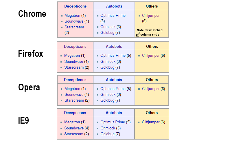
- - Mammalian Verisimilitude 16:16, 20 August 2012 (EDT)
- One interesting tidbit is if you adjust your text size using control+ OR control- it corrects the issue. Only the default text size is in error, although the margin/padding still shows a slight error. --MistaTee 17:36, 20 August 2012 (EDT)


