We switched to this smaller format ~ 1 week ago. Original is @ {{bigquote}} - Derik (edit summary)
Why so ugly, then? [It doesn't even look smaller to me, because the font is bigger & monospaced] - SanityOrMadness 20:41, 18 March 2009 (EDT)
What I said before, plus the note that the English language doesn't use single-guillemots in my experience, preferring inverted commas... - SanityOrMadness 15:06, 21 March 2009 (EDT)
You know, I vastly prefer how this looks to the original quote style. THAT gets lost in the profile text, especially when the double-break isn't used. The light-shaded box sets the quote apart nicely, and makes the font change work better. The only things I'd fix are replacing the brackets with quote marks, and right-justifying the attribution text. I say we go with this. --M Sipher 15:51, 28 March 2009 (EDT)
The guillemots are negotiable... I guess. :( The appeal (to me) is the way they allow you to stick quotes inside of the template without looking skin-crawling-ly wrong.
"How dare you!" "Oh please!"Megatron is outraged to be struck in the face but Optimus Prime doesn't have time for his vanity, "Protection"
“
"How dare you!" "Oh please!"
”
—Megatron is outraged to be struck in the face but Optimus Prime doesn't have time for his vanity, "Protection"
(actually looking at that, I have an urge to adjust the spacing-offset on the first character... right now it's reverse-indented a half space, but i think a whole-space would look better, because the line-starts would line up.) -Derik 02:04, 6 April 2009 (EDT)
I was thinking that multiline quotes would look thusly:
How dare you!Oh please!Megatron is outraged to be struck in the face but Optimus Prime doesn't have time for his vanity, "Protection"
Then it wouldn't matter if they were guillemots or quotes (But you'd need to have different arguments on the template. I didn't get as far as working out the best way to do that) --abates 02:32, 6 April 2009 (EDT)
*shrug* Yet this solution still means no quotes inside. If you ever wanted to quote a passage from a book that included both speech and narration, it'd look weird. (I dont' insist on guillemots-- but they ARE a legitimate quotation mark, and there are benefits of having an 'embracing' quotation mark that doesn't conflict with content it contains.) -Derik 03:30, 6 April 2009 (EDT)
I'm not going to lie; I am utterly baffled that this {{quote}}/{{bigquote}} controversy exists at all. The colored box is ugly, the monospace font is ugly (especially with the mix of non-monospace quotation marks), it occupies no less space than the so-called "bigquote", and I see absolutely no point to having two different quote-templates anyway. To my mind, there is only one time the quote template should ever be used, and that's in the article intro. And that should be a single line by the character in question, no more. Called-out quotes don't belong in subsections, and the "Quotes" section works just fine without any calling-out. I vote for making this template look like {{bigquote}} again and then deleting {{bigquote}} altogether. - Jackpot 04:07, 13 April 2009 (EDT)
↑ These people speak true, here. - SanityOrMadness 23:15, 13 April 2009 (EDT)
Well, I like using quotes in subsections, particularly if their personality is considerably different in that section compared to the rest of the article (eg Cartoon Blaster versus comic Blaster, IDW Furman G1 Megatron, Cartoon Grimlock Vs Every other version of Grimlock). However, I hate this coloured box nonsense. I want the quotes to go back the way they were before.
Yeah, I admit I'm a little confused as well. Why not just make the blue background the at {{bigquote}} instead? -- SFH 14:05, 13 April 2009 (EDT)
And that should be a single line by the character in question
Maybe it should, maybe it shouldn't, but regardless -- it's never going to be limited to just that. There will always be instances when a snippet of other characters' dialogue is a good way to sum up another character, and it's a bit Quixotic to pretend otherwise and design a system that can't accommodate it. -- Repowers 14:28, 13 April 2009 (EDT)
Without individual quotation marks, multi-line quotes look... well, they don't just look bad; they're flat-out wrong. They fail to make the necessary distinction between each speaker's words. None of these systems handles multiple speakers very well, but at least with the old way you could do two consecutive quote templates, leaving the first unattributed, and get quote marks around both lines. So... yeah, I'm kinda in favor of the old system as well. -- Repowers 14:25, 13 April 2009 (EDT)
I have never liked the look of the old quote template. It has nothing to do with "space" (I'm fine with the amount of real estate both use), and everything to do with visual impact. The old style simply does not "pop" the quote, leading it to get lost, especially in the opening profile text. And I hate those giant quote graphics which really fail to set up any proper "border" appearance. Also, the idea that the quote needs to be from the character whose page it's on... really? Are you kidding? Sometimes, OTHER characters sum up people better than the character can themselves. (see: Animated Sentinel Prime.) --M Sipher 14:41, 13 April 2009 (EDT)
My take, I agree with Repowers and Sipher that multi-line quotes are useful sometimes. (For instance, IMHO the best character-summing-up quote about G1 Silverbolt is that "no sense of adventure" exchange between him and Air Raid in "Forever is a Long Time Coming". And just try to get a single line quote from the Jet Twins!)
I also agree with Sipher that I don't like the look of the old quote template. The big quotation marks are ugly and look weird, and I agree it doesn't set off the quote properly.
...not that I don't think the new quote template doesn't also look funny (I'd pick a much lighter blue at the least, the line wrap on the right-aligned citation bit looks ugly, etc.) but it's still a step in the right direction, IMHO. --Jeysie 14:49, 13 April 2009 (EDT)
This weird Courier-fonted monstrosity is the ugliest dang thing I've ever seen, and I want to kill it with fire. --ItsWalky 23:23, 13 April 2009 (EDT)
I think we've established that there is no consensus in favour of this bloody ugly version, and since Derik changed it unilaterally, it should get changed back... - SanityOrMadness 20:25, 15 April 2009 (EDT)
That wasn't Derik, that was me mistakenly thinking we were already using it. --abates 20:33, 15 April 2009 (EDT)
? Derik said on TFW:CP/DCC that "I didn't ask anyone before swapping styles," he inserted this version onto the wiki post-crash, and he reverted me here before changing back - me and him are the only ones in the current edit history. Even if you want some of the blame, that doesn't absolve him :). SanityOrMadness 20:39, 15 April 2009 (EDT)
We swapped styled a few days before the crash to see what people thought.
And being buttache about the chronology involved doesn't change that we need a more flexible quote template, and have been bumping up against the limits of the old one for over a year. View this as an opportunity. -Derik 20:52, 15 April 2009 (EDT)
The wonderful thing about Templates, is templates're a wonderful thing!
Some people vehemently hate the new quote template. Some people vehemently hate the old one. Put your money where your mouth is and design a new one. If we can make everyone happy then it can replace both templates.
Mock something up with messy code, I'll figure out how to skin it with CSS. -Derik 20:48, 15 April 2009 (EDT)
I tried, actually, but I couldn't figure out something that shrink-wrapped/wrapped elegantly around images without using display:inline-block... which doesn't work in IE. Sigh. --Jeysie 22:48, 15 April 2009 (EDT)
My list of problems is more-or-less identical to Jackpot's - the coloured background, the monospaced font, and possibly the size of the thing. I would also drop quotation marks completely from the template itself [I never parsed the huge quotation marks AS quotation marks, just as a "this is a quote" identifier, which is why I'd like to keep them. If they're hated, then dump'em - single lines wouldn't really need the quote marks, and if you're quoting two or more characters, or a sentence which itself includes quotation marks, you can add them manually as-required.]
Bearing in mind that my preference would still be to reinstate {{bigquote}} wholesale, I could perhaps live with a vertical coloured bar or something like that, for:
Take me with you, please Cap! Let me have some of those drugs!
One trait of the old quote template that I'd added in late in the game was the ability to change the color of the oversized Wikipedia style quote marks. I'd add it back in, but I can't for the life of me see where Derik is hiding his bgcolor trait here. Well, that's not true, because Firebug seems to tell me he's defining it in main.css... but that is shall we say a less than transparent method if we want the average user to be able to tweak the template (do we? I don't know). Anyhoo, it was just a simple variable of "color" which defaulted to that nifty little powder blue we had, and accepted a hex color code. We used it to help differentiate multiple quotes, as seen in Transformers Wiki:Ads.--RosicrucianTalk 21:19, 15 April 2009 (EDT)
Contextual CSS means you can't redefine the colors inline... I think.
I need to have a brain-thing about this... -Derik 09:47, 16 April 2009 (EDT)
There was no consensus for the change - at best it's fifty-fifty, and a unilateral change shouldn't stick just because someone bulldozed it through. - SanityOrMadness 18:31, 26 April 2009 (EDT)
You can center it, for when you want it to stand out.
You can make it fixed-width, for when you want to stack multiple quotes (for whatever reason.)
You can turn off quote-marks for troublesome mixed-dialog-and-text quotes.
The 'wasted space' (mostly padding and margins) that give 1.0 such a huge footprint have been tightened up.
This is W3C compliant semantic HTML (or as close to it as mediawiki allows.)
Can I get community feedback on this? -Derik 12:36, 8 June 2009 (EDT)
It still involves the ugliest, most disconnective part of "2.0" - namely, the lilac background. That needs to go. All the "compromises" to the "2.0" look in the new version, except the padding (which still seems visually excessive) are in areas that are far less important.
Transparent background with some other means of highlighting. Then there's something to talk about. - SanityOrMadness 13:51, 8 June 2009 (EDT)
Okay, it seems to me we're headed nowhere positive with trying to reconcile the two quote styles. To me, adding the big honking smartquotes to the blue box actually is worse than either iteration. So what I want to propose here is actually... neither. In fact, none of the three proposals. Instead, I think it would be neat to re-center our quote box design directly in the Transformers theme of the site. To do this, I think it would be nifty to purposefully mimic a style of speech balloon from the comics, particularly the Richard Starkings balloons in Generation 2. They're the most distinct way the comics have done speech balloons, and they scream "Transformers" while still able to be designed to be fairly layout-friendly. Such a scheme could have options for when Autobots, Decepticons, and neutrals (using the way the Dinobots spoke), possibly also an option for humans.--RosicrucianTalk 14:11, 8 June 2009 (EDT)
And I should point out that ideally, this proposal would sidestep "quotation marks or none" entirely.--RosicrucianTalk 14:19, 8 June 2009 (EDT)
By putting quotes that are potentially caption text inside a speech bubble?
I would disagree about "sidestepping," it merely changes the visual metaphor being used. Makes it impossible to remove them does not "settle the quote issue," it just canonizes a lowest-common-denominator bad choice. -Derik 15:07, 8 June 2009 (EDT)
...maybe. I quite like the idea (see 'Bot mock on right. I'll do 'Con and Dino' ones in a few minutes), but I've got a few concerns, both practical and conceptual:
First, can an octagonal shape like this be done natively in CSS? Preferably without too much whitespace (in the mock, I just erased the decorative quotation marks and drew around the {{bigquote}}. That's the sort of amount of whitespace I'd like).
Similarly, the only way to do the strip down the side would be as a repeating image, wouldn't it, which would limit the options muchly? [The G2 comic used individualised colour palettes for every character, and randomised the order they were used]
Please, no tails on the quote, full stop (which is why I left them off in the mock. Take them out of the context of a comic panel and they always look ridiculous) - SanityOrMadness 15:03, 8 June 2009 (EDT)
If it can be done, it gets my full HELL YEAH vote. -- Repowers 15:06, 8 June 2009 (EDT)
But that's not what the G2 textboxes looked like.
They had one square per line-height, and the color of the box was turned black if there was a bolded word on the line. -Derik 15:10, 8 June 2009 (EDT)
They weren't always consistent about the black - flicking through G2 #5, there's multiple instances of them forgetting the black entirely, or else knocking out the wrong box (and the Autobot version was always "low"; and of course had ~half boxen at either end). And as for line height... it's (1) a very quick mock and (2) an adaptation. There's no way we can replicate the font (even if it was desirable to do ALL CAPS MONOSPACE, which it isn't), and the lines are inevitably longer because it's not ACTUALLY a three-word-wide speech balloon. - SanityOrMadness 15:34, 8 June 2009 (EDT)
Yeah, I'm cool with no tails. You've actually got it pretty much exactly how I imagined it. Derik is our CSS wizard, so it's up to him as to how feasible this is. If the octagonal isn't possible, we could maybe approximate it with moz-borders.--RosicrucianTalk 15:08, 8 June 2009 (EDT)
I don't see why it couldn't be done, although it would take either a little extra markup to accommodate the necessary backgrounds to provide the slants, or some fancy finagling to get it to work in IE7 (since IE sucks and doesn't support the nice :before and :after properties that would make the matter much easier).
Of course, if you were willing to settle for just normal square corners/rounded in FF3, it'd definitely be dead easy.
Doable either way, though. There's a number of CSS-based "rounded corners" ploys out there, and this is just an adaptation of that. --Jeysie 15:16, 8 June 2009 (EDT)
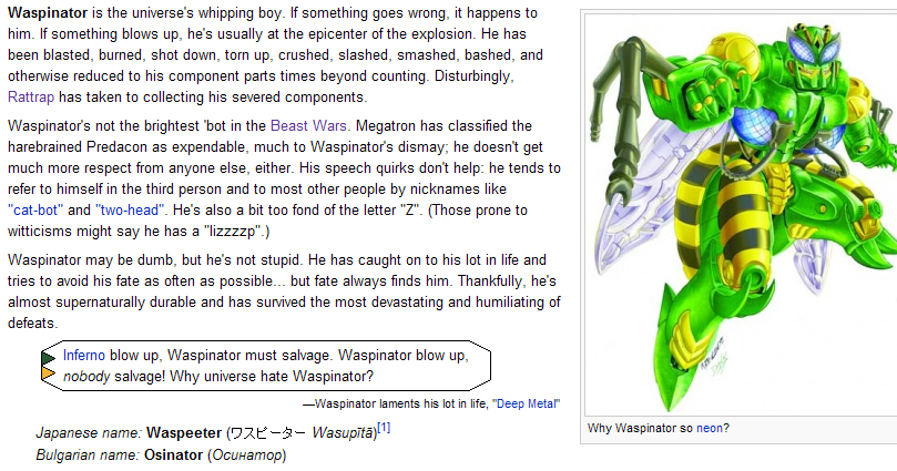
Waspinator quote, 'Con-style, on Waspinator.For 'Con version, see right. - SanityOrMadness 15:34, 8 June 2009 (EDT)
So we're now moving from "recode for semantic markup" to "make the code even messier in pursuit of a poor approximation of a look that doesn't apply for the vast majority of Transformers fiction it will be applies to."
I vote to leave the quote template the way it is. -Derik 15:24, 8 June 2009 (EDT)
Well, we have to do something to the thing. The look with the giant quotes that wraps poorly and doesn't handle multi-line quotes is bad and I never liked it, but the giant lilac block version is equally bad-looking, with its only good point being that it improves the functionality a little.
We pretty much need something that:
Wraps well.
Handles quotes with more than one dialogue line.
Is distinctly set off from the rest of the page text.
Isn't hideously ugly.
Plus "extra markup" is still doable without being horrible. Between putting the whole thing in a perfectly semantic BLOCKQUOTE, and the quote itself and the attribution in two equally semantic separate paragraphs, all you'd need is a single extra DIV for the fourth corner. And grouping the quote paragraphs(s) together separate from the attribution paragraphs couldn't hurt anyway. --Jeysie 15:41, 8 June 2009 (EDT)
I realize that the majority of Transformers comics don't use this. In my mind though it is the most distinctive style they've been done in, and all our other quote templates have been either holdovers from MediaWiki stock templates, or new solutions that while they may be semantically perfect... just don't really look good at all. And it just seems to me that when we have a design/layout issue here, we go for functionality certainly but we also frequently go back to the well and the source material we're documenting. So yes we do need this to format right, and I think we definitely can do that, but we can also have a little fun at it while we're doing it, and further distinguish our pages from stock MediaWiki.--RosicrucianTalk 15:54, 8 June 2009 (EDT)
Dumped the background. Smaller quotes is the major visual change.
Is Semantic, can dump the quotes, can be centered or fixed-width easily.
Can we switch to this while we decide the future of the quote template? -Derik 15:54, 8 June 2009 (EDT)
Better to wait for an agreed, permanent version before we change, I think; rather than making a temporary change and then a permanent change in relatively short order. - SanityOrMadness 16:08, 8 June 2009 (EDT)
Yes but see-- I think those don't look good, evern seperate from them being inappropriate.
We use the quote template for quotes by and about humans too-- including non-fictional humans. I strongly oppose styling it as "robot dialog." -Derik 17:55, 17 June 2009 (EDT)
Er, how are they inappropriate exactly? It's perfectly semantic code, and I like the idea of speech bubble styles for things people are, well, speeching.
As for your second criticism, the colors and styles are changeable on both. We can easily have different colors for Autobots and Decepticons, or remove the color/thin the lines for humans, since it's just a matter of swapping out altered backgrounds as needed. I just didn't feel like spending the time right away making all the different colors. --Jeysie 17:59, 17 June 2009 (EDT)
I like the idea (I loathe the current quotes format so much), but I think overcomplicating things with a bunch of different styles based on what is talking is a bad idea. I'd much prefer a single standard look that fits robot, organic, or whatever. --M Sipher 18:20, 17 June 2009 (EDT)
Well, the basic underlying code is semantic, handles multi-lines fine, etc. Just a question of what we want it to look like. Something simple like these is possible, too. I was just trying to mock up the ideas people already came up with. (Though personally I don't have any problems whatsoever with changing things like colors based on who's speaking, as it gives a little eye candy and conveys information.) --Jeysie 18:55, 17 June 2009 (EDT)
So it will become more impossible to quote multiple speakers, or to quote mixed speech and narration? -Derik 19:08, 17 June 2009 (EDT)
No, it'll become more easier to quote multiple speakers, mixed speech, and narration, because we can handle styling separate paragraphs as needed by swapping out classes, or style the whole quote part different from the attribution part if needed. --Jeysie 19:14, 17 June 2009 (EDT)
After the "Quote 2.0" template was rejected as 'too ugly,' a version of 2.0 was made up which mimic'd the 1.0 look-- but had the clean code and better spacing of 2.0, but it was never rolled out because "we're totally working on 3.0!"
That's been stalled for some time now, so I've moved the "Quote 1.5" template in. It's visually similar to the original quote template with one obvious exception exception: The "big quotes" on the ends are much smaller.
They were originally 35px tall, and they looked funny with the slightly more closed spacing on the citation. They're 20px now. If people feel that's too small (and it's a pretty noticeable change, I grant you) we can experiment until we find the right size. -Derik 21:09, 2 July 2009 (EDT)